Visual Identity, Logo Design
2025
In collaboration with the 3G office team
The opportunity
Real Estate Futures Institute is an independent platform that combines strategic thinking and collective action to imagine and build possible futures for the real estate sector with sustainability, impact, and excellence in mind. They desired their previous logo to better reflect the mentioned attributes visually, and were considering a change of name from 'Real Estate Future Trends' to 'Real Estate Futures Institute', to better align with an authoritative look and feel as a think tank.
The solution
Developing a bold symbol that reflects REFI's ambition to activate and influence strategic thinking in the discourse of the future of real estate. The final solutions visually merges the concepts of buildings, sustainability, and possible futures, using its expanding shape to symbolize those possible directions.
The original logo used colour and bold typography to evoke a bold look and feel commonly associated with the real estate industry. However, the squared shape was not accurately reflecting the 'open', 'collaborative' and 'sustainable' characteristics of REFI. In addition, the platform was previously known as 'Real Estate Future Trends' and used in their annual conference event, which gathers a select group of thinkers and strategic leaders to share their disruptive and committed visions for the future. However, the organization's aim was bigger than a specific event and therefore needed to communicate this idea of a permanent structure that has a long-term vision. This resulted in the change to 'Real Estate Futures Institute'.


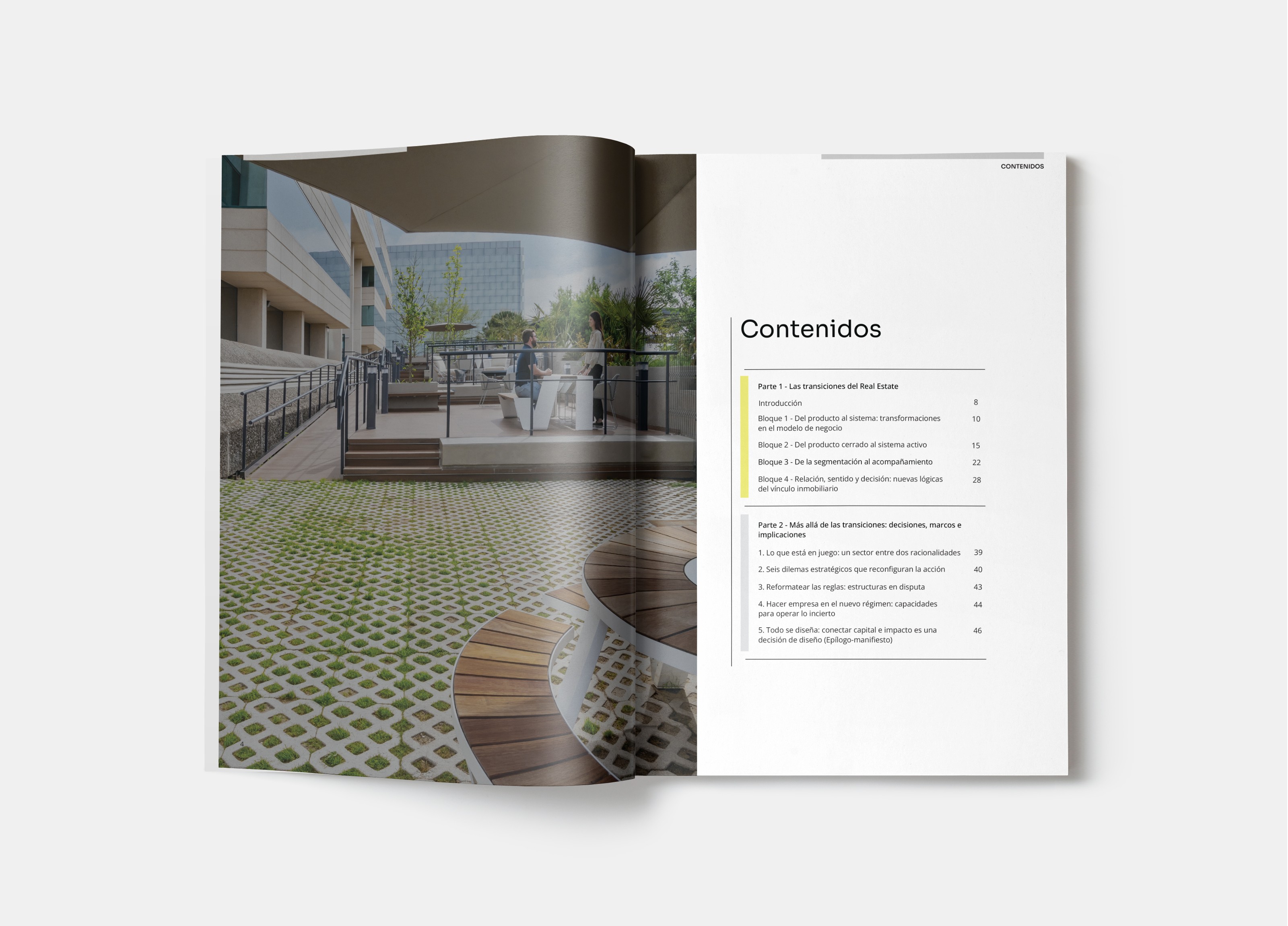
The logo made its debut in the new brochure project titled 'Real Estate Transitions: shifting trends in real estate product development', designed by me and executed in partnership with the 3g Office team.