
My Role:
As a UX/UI Designer I planned and conducted user interviews and usability testing and designed the final mobile protoype.
Deliverables:
The Team:
I have worked with 2 stakeholders and 1 developer
Timeline:
6 months (year 2024)
How it started
The main research goal was to understand better our user’s motivations, beliefs, desires, and expectations surrounding the use of weather apps. We also aimed to understand the minimal amount of information users needed to make weather-based decisions, so we created a 5Ws framework to gather all the information we had in a clear and concise manner.


Competitor Analysis
We analyzed both weather and fitness apps to gain insights into their content presentation methods. Specifically, we examined examples of progressive disclosure in Weather Apps taking inspiration from the thumb-accessibility of “Windfinder” for instance. We also took inspiration from the “AllTrails” app, which enables users to create lists with their saved locations. Lastly, we looked at how apps like "Met Office" use color to provide more information on the map layers.
Analyzing Weather and Fitness Applications
Windfinder's Map Page
Progressive Disclosure
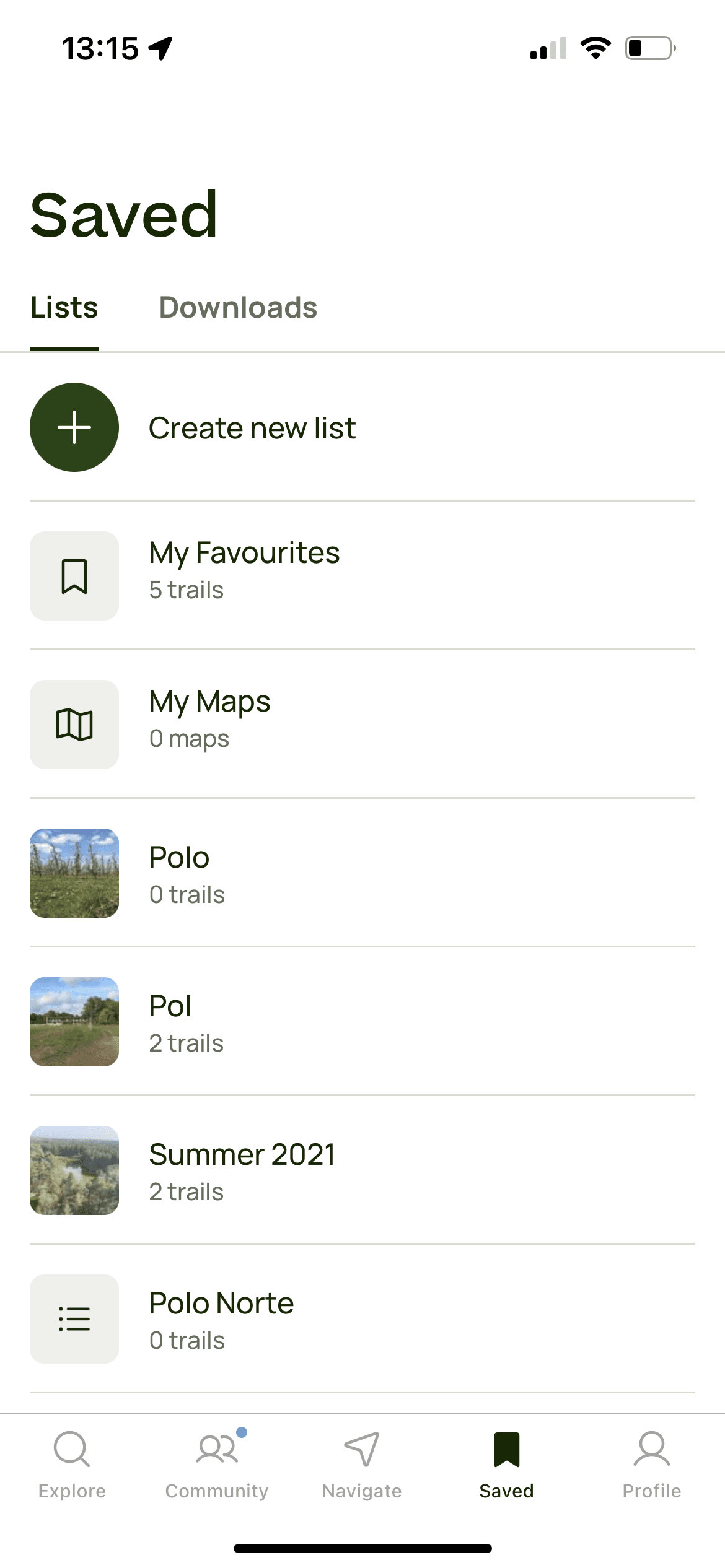
Saved Items
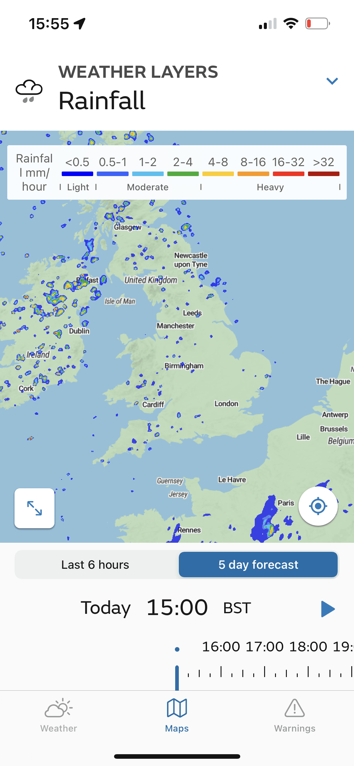
Map Layers' Legend
Takeaways to Competitor Analysis
1
Generic vs specific
2
Complex Jargon
Weather-related jargon can
be confusing for users who
are not familiar with
meteorological terms.
3
Information Overload
Ideating the "Maps Page"
Sketch
Ideation 1

Iteration 1

Iteration 2
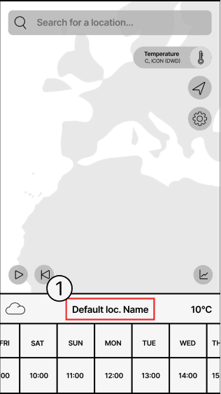
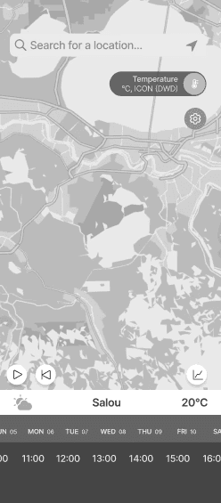
We designed the initial screen to display a default map view. When users entered a location in the search bar,
it appears as the 'Default Location Name'.To avoid information overload, we added a navigation bar for separate access to settings and other features.
Testing showed that 4 out of 6 users panned the map instead of using the search bar, so we separated the 'Search' feature to test how dependent users are from this feature. We also replaced the cloud icon with a map layers icon for more intuitiveness.
Ideating the "Search Page"

Sketch

Iteration 1

Iteration 2
In the first sketches the search bar was part of the map and when the user searched for a location it would appear instead of the “Default Location” description.
In the second wireframes session, the user is able to see his "Home Spot" locations and "Saved" locations.
Testing showed that 4 out of 6 users panned the map instead of using the search bar, so we separated the 'Search' feature to test how dependent users are from this feature. We also replaced the cloud icon with a map layers icon for more intuitiveness.
