
Case Summary
What was the problem?
At our initial meeting, the client expressed concerns that their current website’s look and feel were not currently reflecting their brand identity. They believed their website was cluttered and therefore made it difficult for patients to efficiently find the information they were looking for.
My Role:
UX/UI Designer
Deliverables:
The Client:
The Centro de Estudios Neurologicos Varela de Seijas
Timeline:
6 weeks (September - November 2024)
Analysing the current design
For this project, I was working with an existing design which provided a foundation to reference already and an idea of the functional requirements I would need to consider.
Functional Requirements:
1
Inicio/ Home Page
2
Especialidades/ Specializations
3
Sobre Nosotros/ About Us
4
Talleres/ Workshops
5
Pedir una cita/ Book appointments
6
Portal Paciente/ Patients Portal
7
Contacto/ Contact


1 Matilda: Potential Patient
What user flows need to be designed?
1
Job to be Done
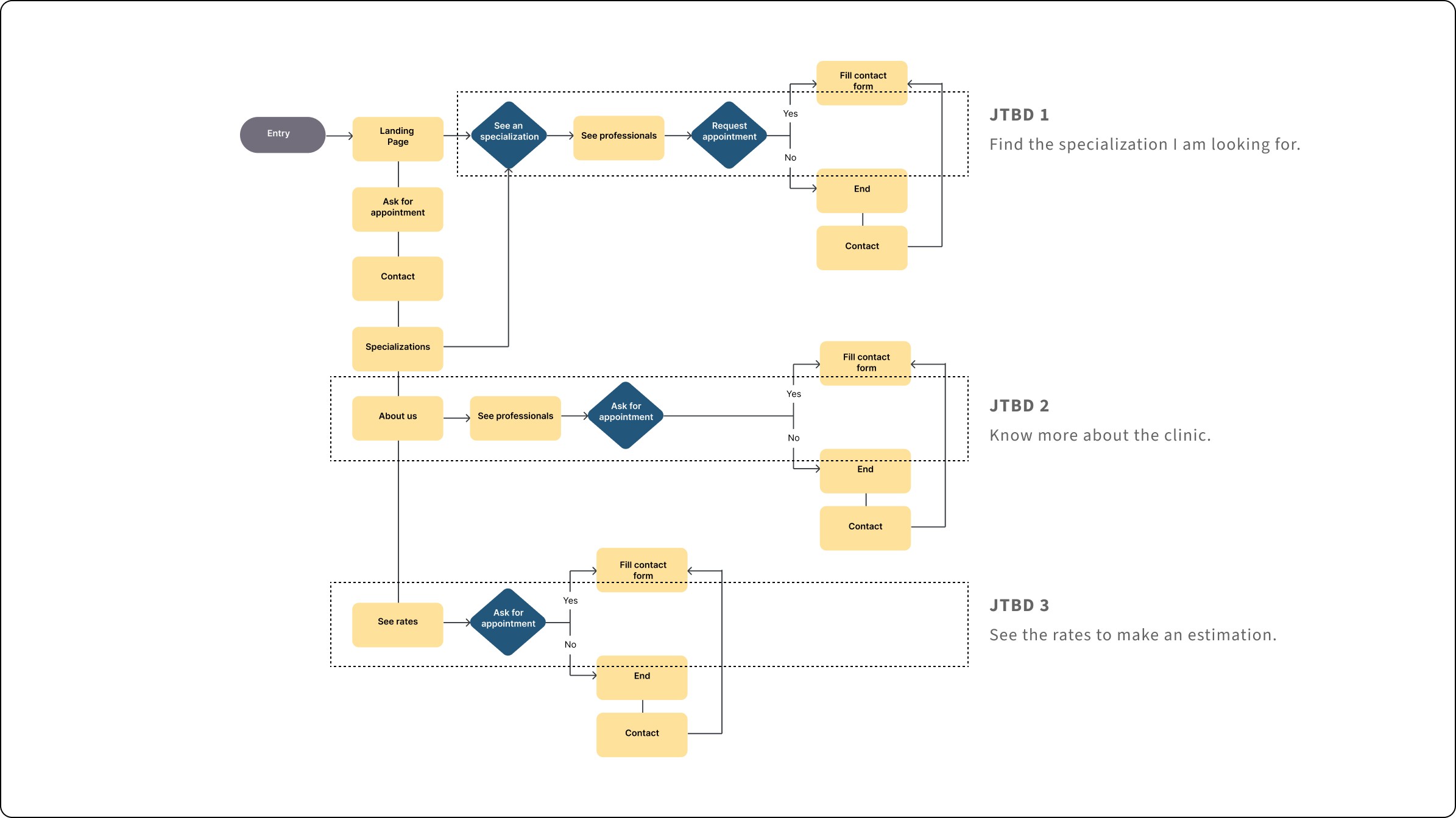
As someone seeking specific medical care, I want to know what specializations the clinic offers so that I can find the care I need.
2
Job to be Done
As someone considering
becoming a patient, I want to learn
more about the clinic so I can
effectively determine if its
services meet my needs.
3
Job to be Done
As someone interested in
receiving services, I want to know
the rates so I can see the costs
and determine if they fit
my budget.
Performing a design audit

Developing wireframes

“As someone seeking specific medical care, I want to know what specializations the clinic offers so that I can find the care I need.”
“As someone considering becoming
a patient, I want to learn more about the
clinic so that I can effectively determine if
it’s services meet my needs.”


“As someone interested in receiving services, I want to know the service rates so I can see the costs and determine if they fit my budget.”
“As a patient needing specific medical
care, I want to schedule an appointment
with an expert in that specialty to receive
medical attention that meets my needs.”


“As someone who needs to get in touch with the center, I want to be able to leave my contact information so that the center can reach out to me.”
Moodboard

Color Palette
USED AS ACCENT: PUMPKIN
USED FOR THE TEXT: ONYX
USED AS PRIMARY: BABY POWDER
BACKGROUND COLOR: PURE WHITE
USED AS SECONDARY: VERDIGRIS
Typography
Aa
Source Sans Pro
SemiBold
SemiBold

Mockup


How did I design for different breakpoints?
1
2
3

The prototypes that empowered client feedback
Task 1: See specializations


Task 2: See rates


“As someone who needs to get in touch with the center, I want to be able to leave my contact information so that the center can reach
out to me.”
Task 4: Know more about the clinic

Key Learnings
Projects don't exist exit in a vacuum: if I hadn't collaborate with my client on this project by listening to his concerns, ideas
and implementing the feedback received I would have missed the opportunity of learning about the project and the health industry.
I need to take it one step at a time: I learned to break down the different design challenges I encountered in the process and
started solving on at a time.
Next Steps
Validate the mood and functionality of the website by conducting usability research and a first round of usability testing with patients.
Get more information about the experience patients have when they book an appointment in the website (e.g. by conducting focus groups).
